Mckesson Canada
Enterprise Pharmaceutical Web Application Design UI / UX Case Study
Project Overview
Mckesson Canada’s enterprise software which services both national and independent pharmaceutical companies across the country wanted to improve the usability of its platform, to make it more intuitive as well as modernize the user interface and branding.
Problem Statement
The existing software was not easy to use and required heavy support and training for onboarding new users. This was not cost effective and did not create an ideal user experience who typically used the software for long hours prescribing medication as well as maintaining customer profiles. There was an opportunity to make the software easier to use and add features that users wanted and declutter and remove the features that users rarely used.
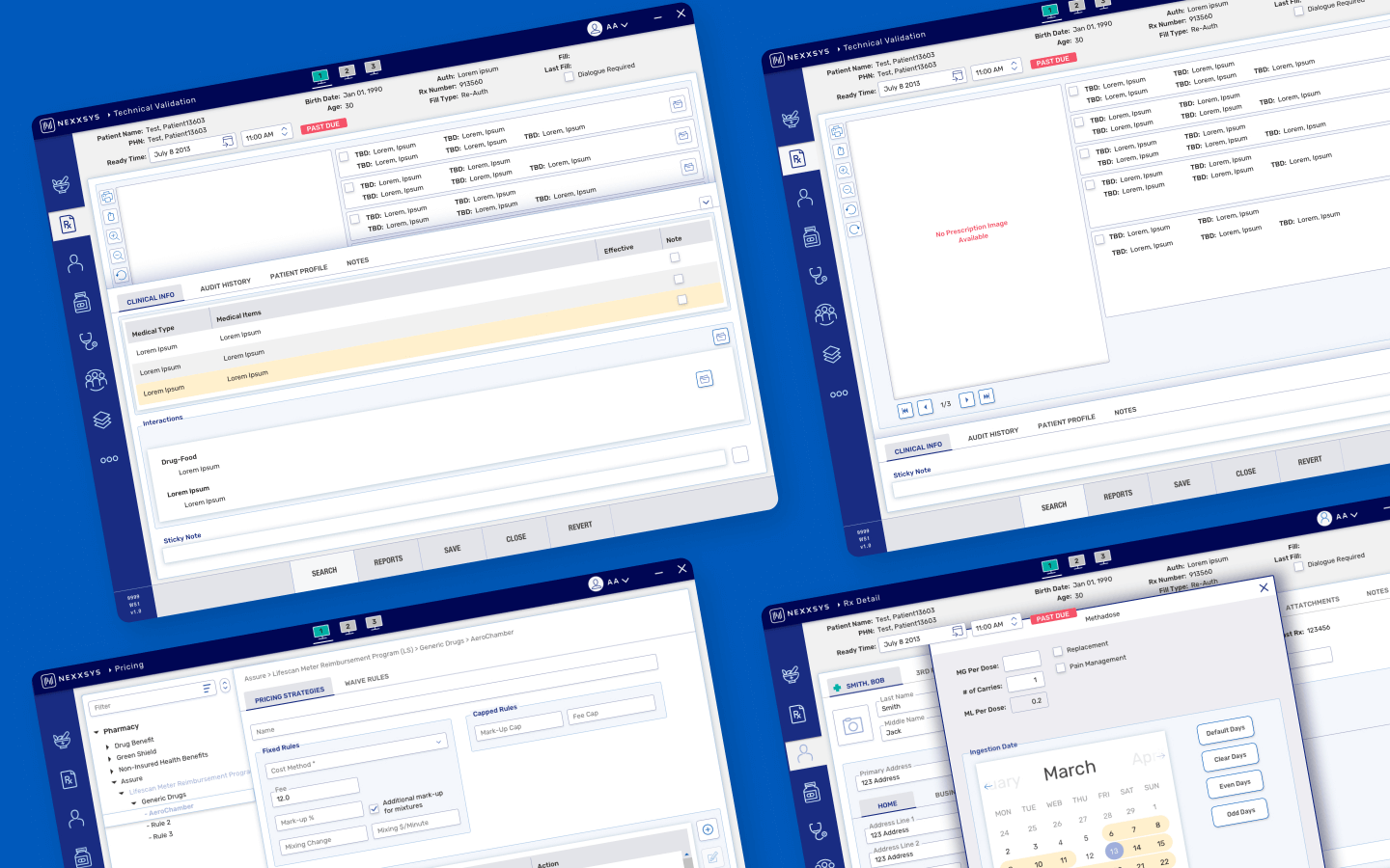
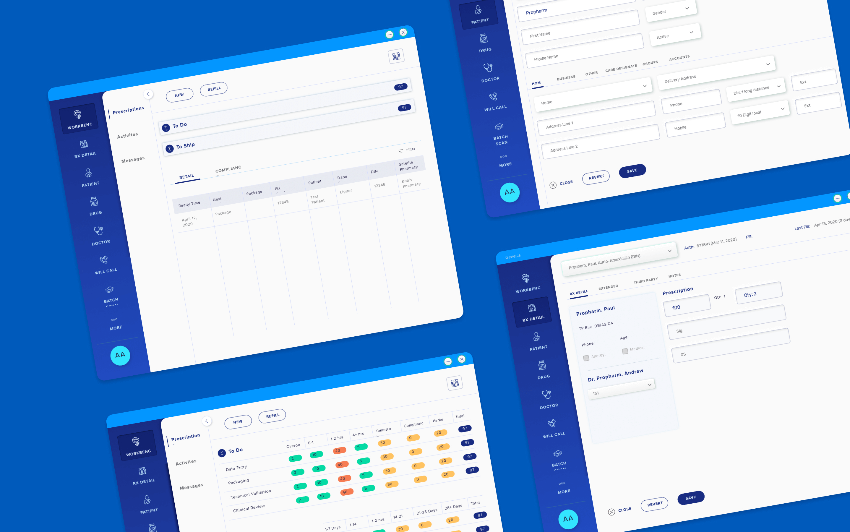
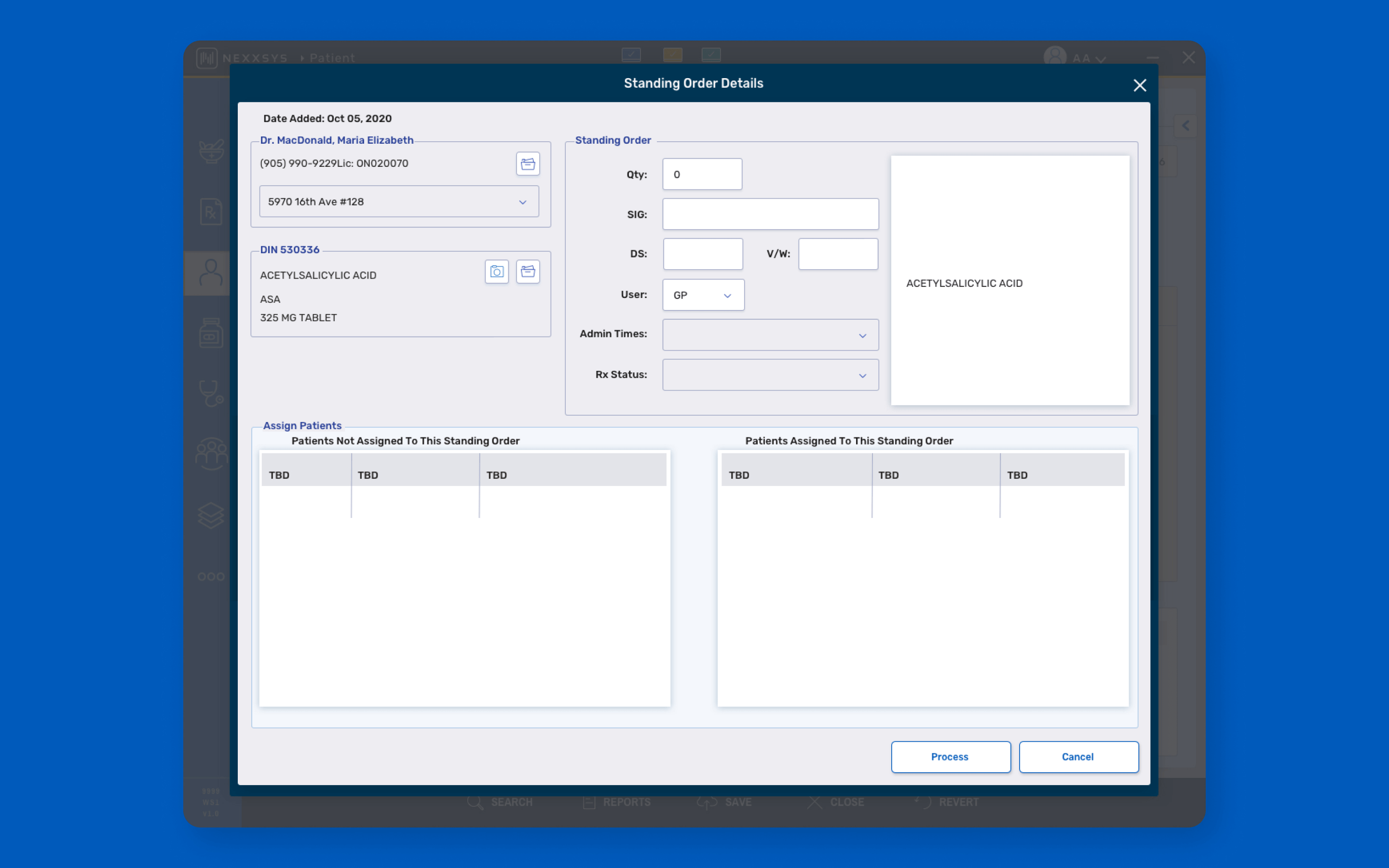
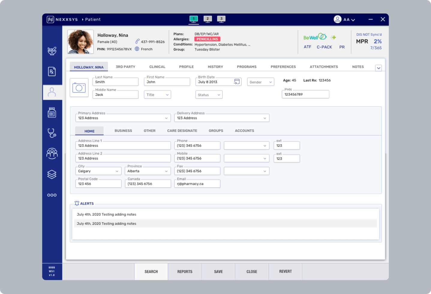
Reimagining the application form the ground up
Since the application was in need of a complete overhaul, we applied the atomic principles of design by reexamining the core components of the application, meaning we explored design options for core elements such as buttons, input fields and typography and allowed the screens to be grown from these smaller elements.
Problem Solution
Using Google Material design as our foundation for a new design system we reimagined the visual language and created consistency and efficiency. We customized every component in Material design to better fit our specific user stories and branding. The result was the creation of a robust and versatile components library as a source of truth for designers and developers; a new modern and fresh user interface combined with a simpler new user experience of the application with a focus on being scalable in the long-term.
Creative Process
Working with Mckesson’s stakeholders, various relevant design directions were explored using moodboards, style tiles as well as low and high fidelity mockups.
Using moodboards and low fidelity concepts enabled us to quickly hone in on a direction for the overall look and feel. Once the overall direction for our visual designs were established, I created a full set of custom icons and a design system.
Having this visual hub in place enabled us to then work through specific user stories and screens in an Agile environment very quickly to design 400 plus templates for the entire application within eight months.
Designs were created using Sketch, Adobe XD and high-fidelity prototypes were handed off to developers using Invision and XD.