Ontario Health (One Access)
Innovative design thinking for a new health care application
Project Overview
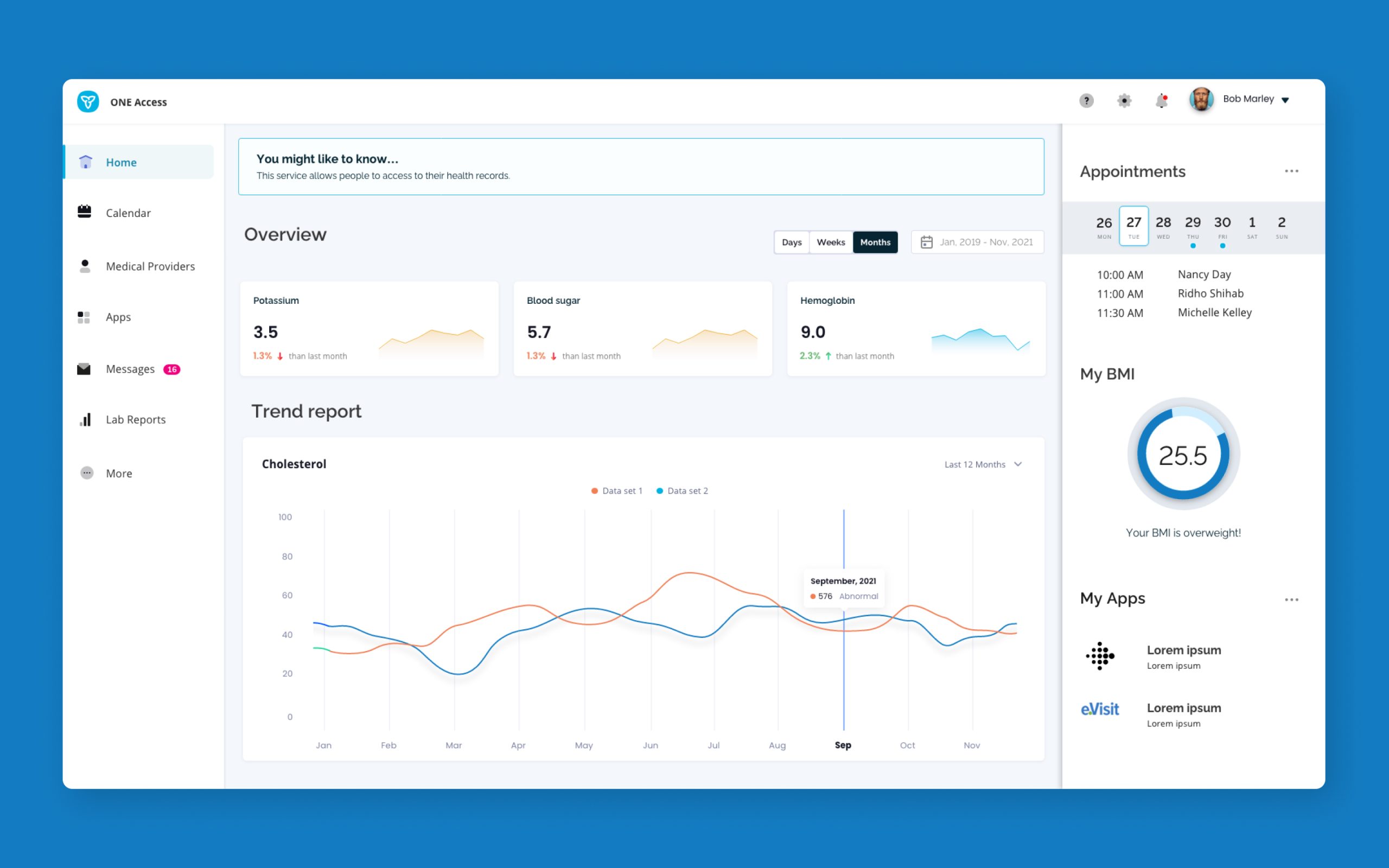
As patients’ lives have evolved in a post covid world and as more and more experiences are migrating to the digital realm, there is an incredible opportunity to redefine both the patient’s and the health care provider’s service experience and enhance care delivery. The goal of ONE Access was to simplify, harmonize and modernize how digital health services are discovered, enrolled in, and accessed. For health care providers and patients to achieve better health outcomes, ONE Access will provide a single point of access to relevant health information with modern customer-centric experiences, when and where they need it the most.
Problem Statement
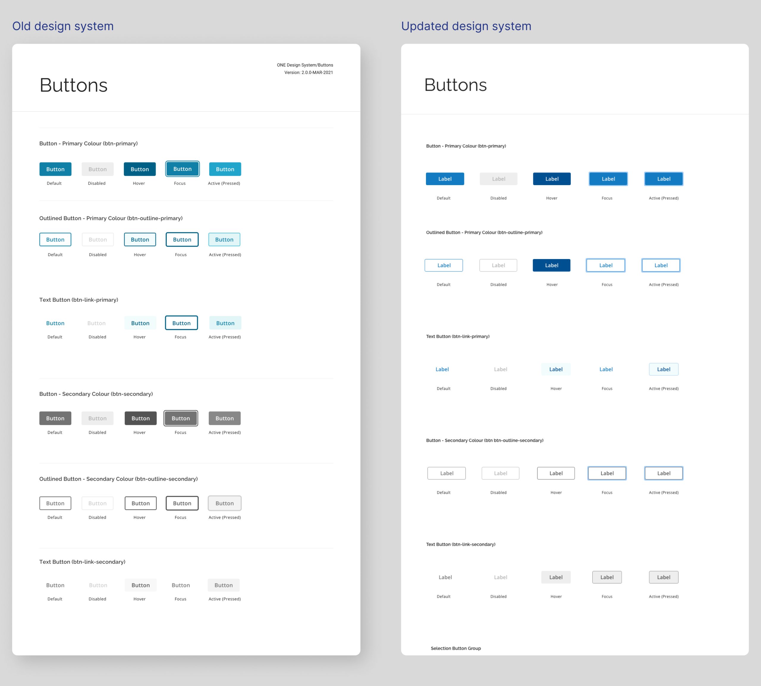
As a net new product there was a need to create a new design system that felt modern and relevant to the cutting edge concepts envisioned for the new platform, and yet still feel that it belongs to the larger Ontario family of products. The challenge was how do you update an old visual language and create a new one without alienating the older system?
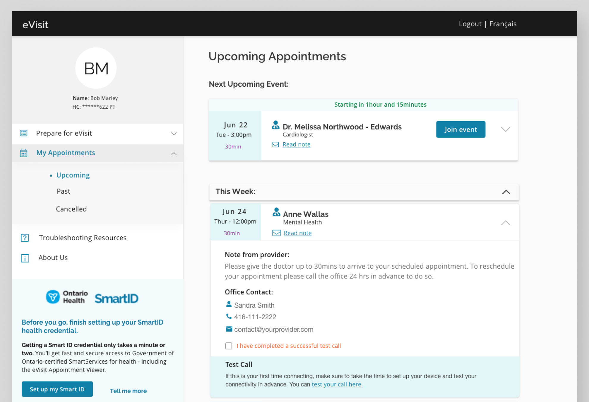
A new platform, a new visual language
When looking at the existing design system the idea was to implement an evolutionary process rather than a revolution. We retained everything that was working with the older system and gradually introduced incremental updates to the existing components which also had the most impact in refreshing the UI. In this way we created a new tone in our communication while still belonging to the parent system.
Problem Solution
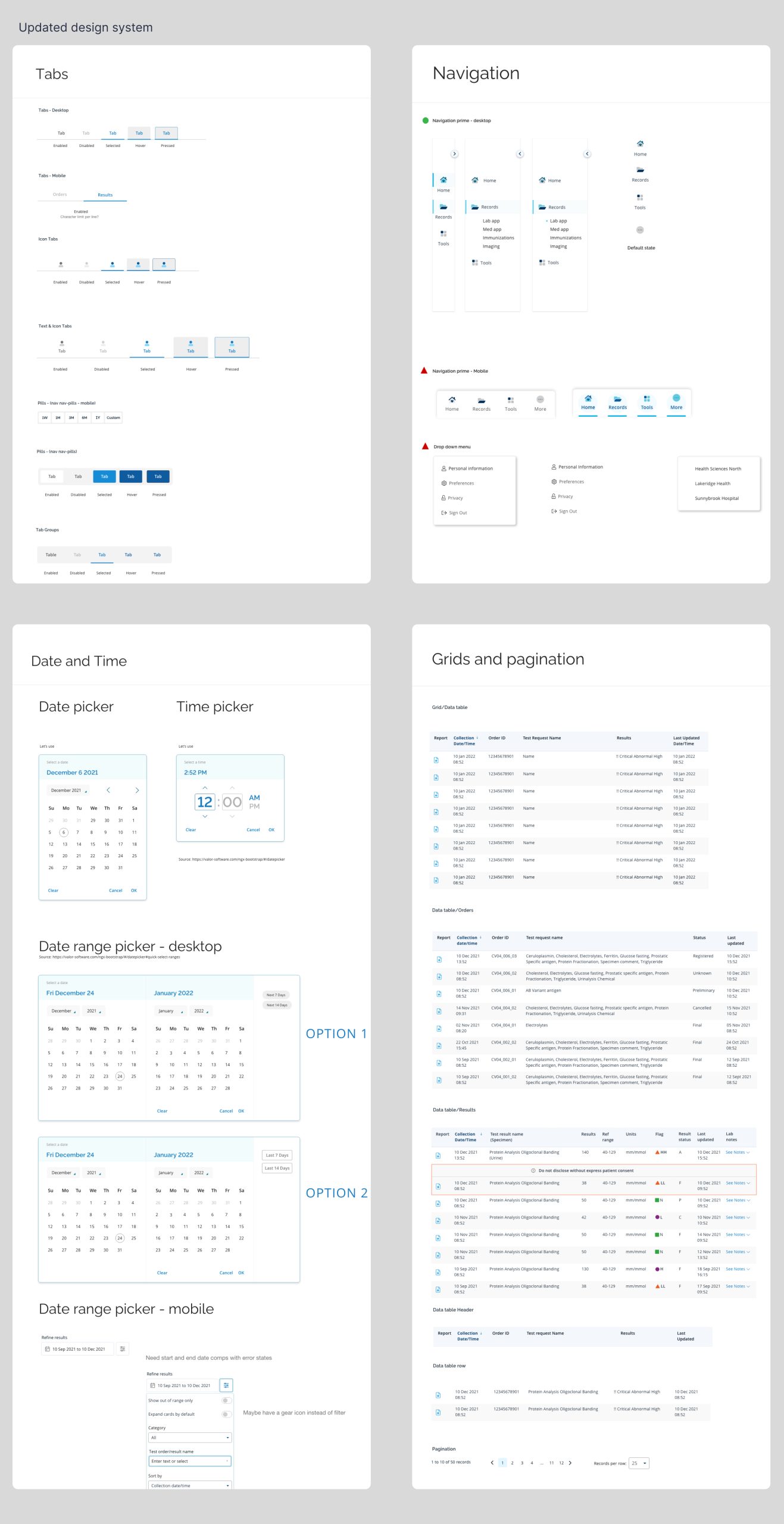
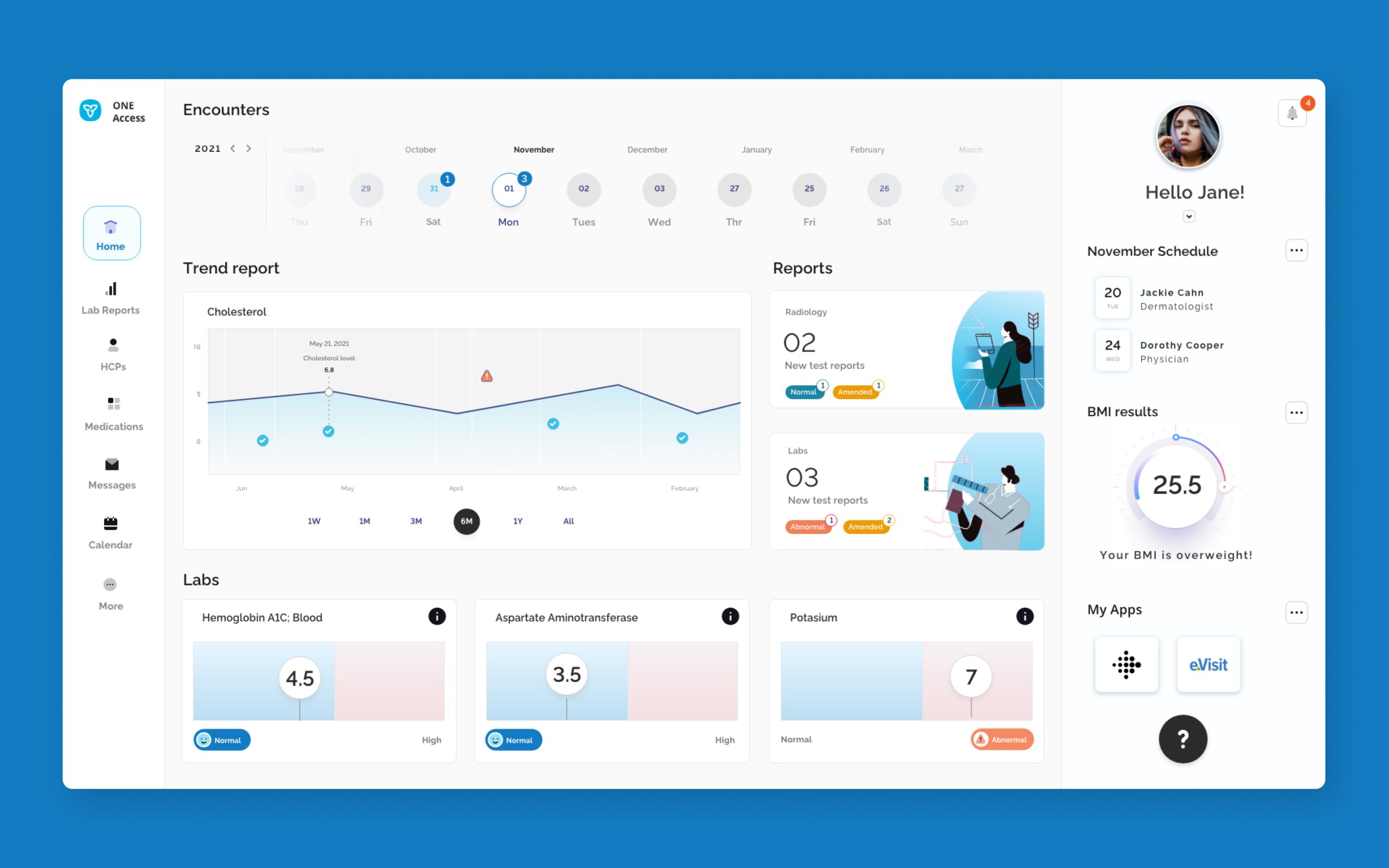
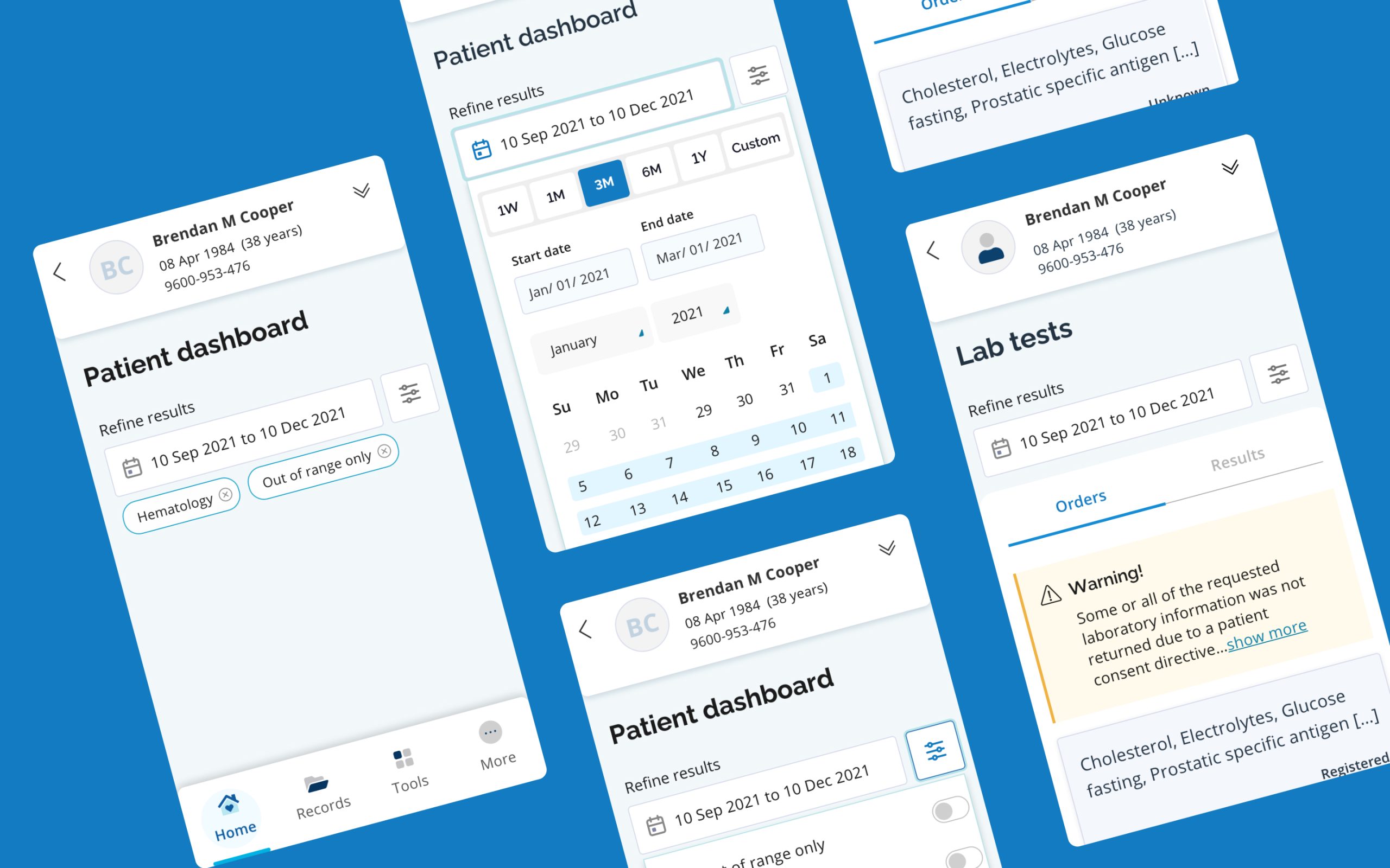
Before we could solve any problems we needed to have clarity on what exactly the problems were. We needed to identify a focus on solving the right user problems so to this end we started with user interviews and research. We conducted group interviews as well as one-on-one interviews, online surveys and questionnaires. Using the information from the research we were able to identify a common thread and a theme on what the biggest pain points were for patients across a wide spectrum of age, geography and gender. With this information in hand we were ready to problem solve. Using Bootstrap as our foundation we streamlined the design process as well as the hand-off to the developer teams by modifying and customizing Bootstrap patterns and core components rapidly and with great impact. Our first order of priority was the delivery of a robust asset library and design system that was shared across teams and that could be used as a central point of reference. We then used this new updated design language to build new screens that looked fresh while still feeling like they belonged to the same larger family of Ontario digital products.
Creative Process
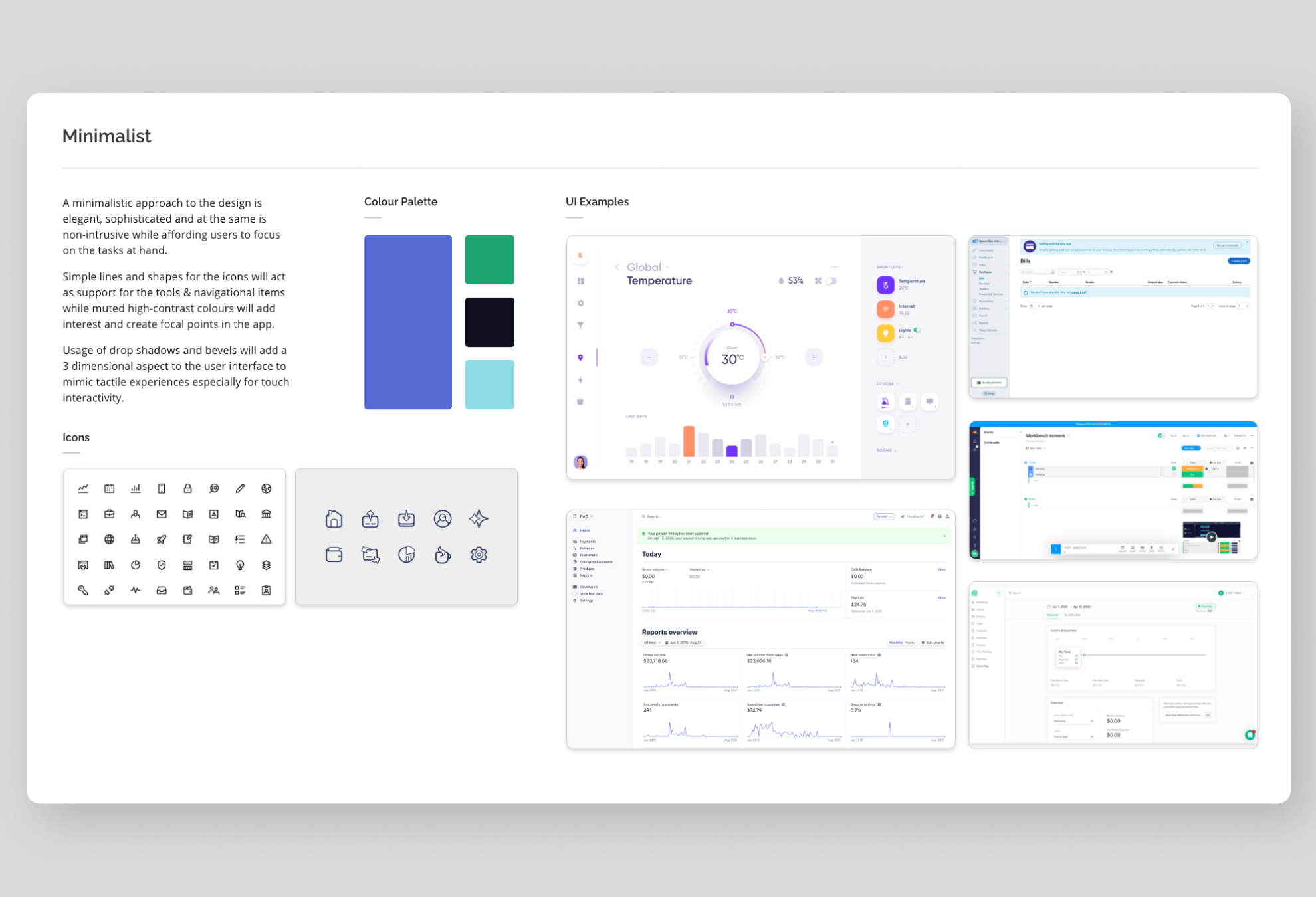
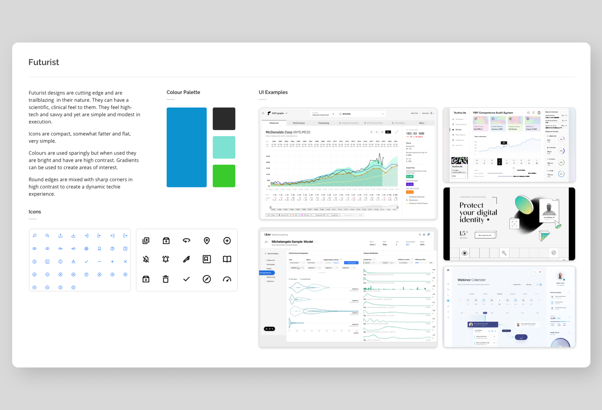
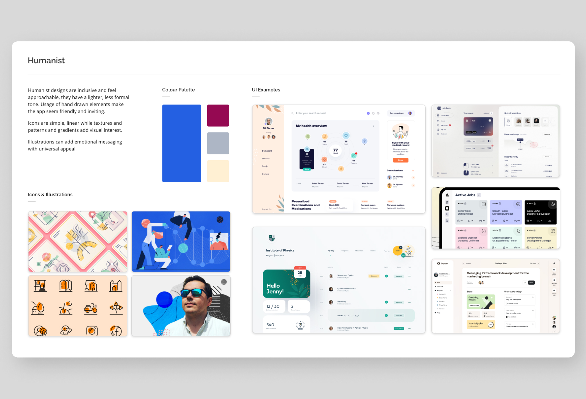
Creating a new product with inclusivity and compassion at its’ core while conveying a message of modernity and tech friendliness is a challenging task and deciding the tone to use which would incorporate these principles while taking a unique approach made it even more of a challenge. To quickly get consensus on the right visual approach, we started by creating moodboards and high level concepts, defining three distinct approaches and paths that could have worked for our purposes. Almost unanimously a general consensus was reached for one of the directions.
With our visual design approach decided we started by looking at the existing components in our sister products and also looked at the components as shipped by Bootstrap and began to refine and modify our components to bring them firstly more inline with Bootstrap with an eye on a quicker development cycle. With these refinements while we retained the core DNA of the brand we applied the new UI design updates to create a new visual tone without straying too far from the overall brand language. Once we had enough components and icons updated in our library we then used mid-fidelity concepts to address user stories delivered within each sprint.
Designs were created using Adobe XD and high-fidelity prototypes were handed off to developers using XD.
