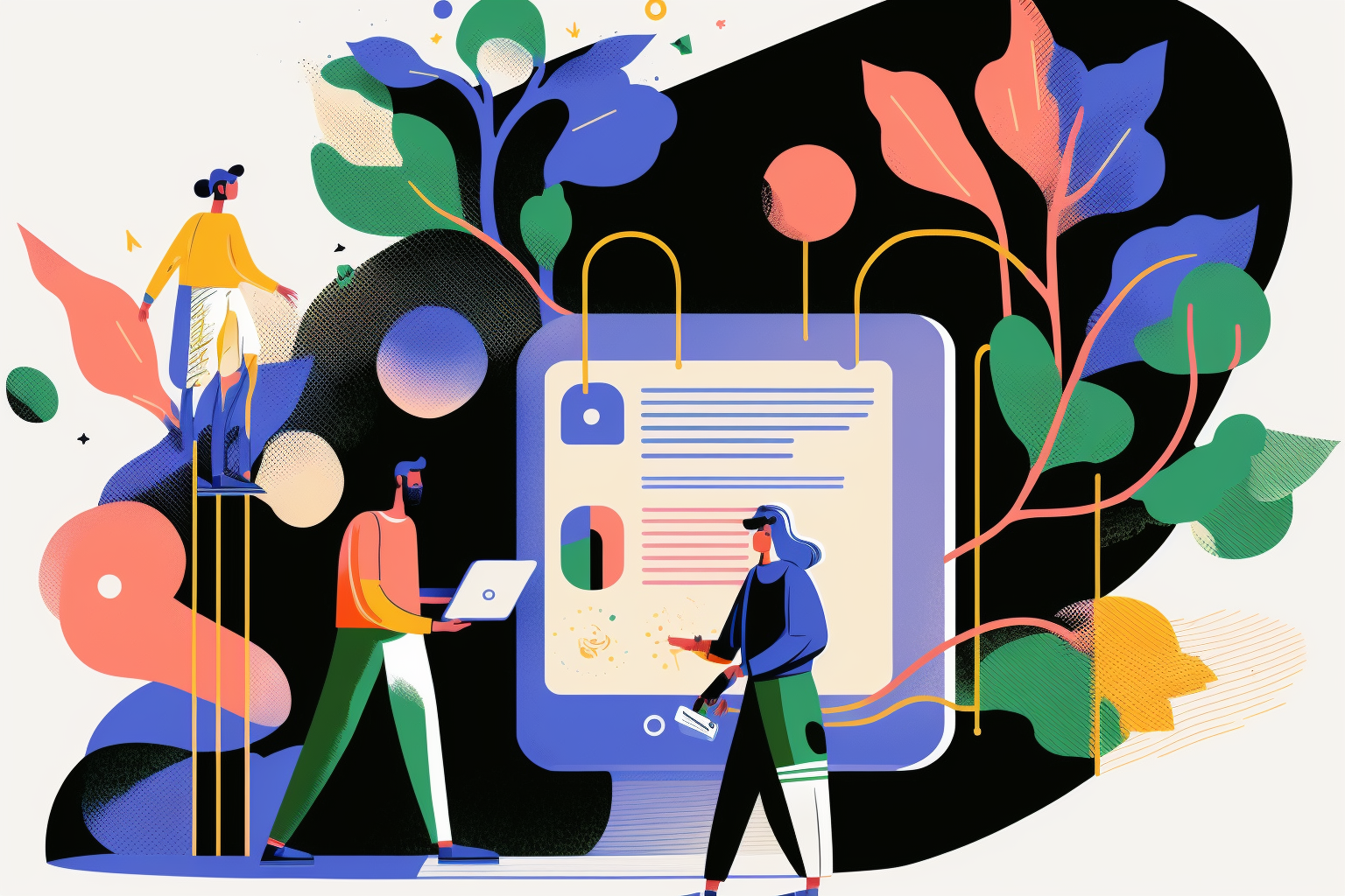
Mockups vs. Wireframes vs. Prototype. Which one to use when?
A working prototype is an essential step in the launch of any successful product or website but it is not the only stage in a proper UI / UX design workflow. The general tendency is to implement three preliminary stages of wireframe, mockup, prototype in the interaction design process. The goal of each step is to allow you to fix any usability issues while the cost of fixing them is still small. Each stage also allows you iterate your design with a select segment of your audience in preparation for a final public release. There are various methods and levels of fidelity in the design of prototypes and to some extent, there seems to be confusion about what exactly a prototype is. One emerging UI/UX workflow is to design in the browser as soon as possible, thus eliminating the mockup stage altogether.
As important as wireframes and mockups are in getting you closer to a finished product, it is a prototype that brings you the closest to a finished product and lets you test out an interactive design before it goes public.
Nowadays there are lots of great tools in the market that can help with the creation of a high or low fidelity prototype. In this article I want to talk about a few of the leading tools in the market, what each one is good at, and my recommendations on each. Before we get too deep into tools I think it’s a good idea to clarify the definitions of some commonly used terms, since I often see them confused with each other. Here’s my attempt of outlining the differences between the three stages but for a deeper read, please check Marcin Treder, CEO of UXPIN series of articles on the differences between the three stages of wireframes, mockups, and prototype.
Wireframes, low-fidelity design
Typically wireframes use simple grayscale graphic elements like lines, boxes, and other geometric shapes to communicate information architecture, content and layout considerations.
The purpose of wireframes is to answer three basic questions of how the content is grouped, how information is structured and a basic visualisation of the user interface.
Wireframes are deliberately stripped of any creative treatment like typography, colours and / or imagery to bring focus to usability and user journey. A wireframe is similar in purpose to an architectural blueprint. You can see how each room relates to each other or how a given space is allocated, but you don’t see the finished product. You don’t really get a realistic feel of what being in that space is like.
A well thought-out wireframe can give the client an overview of how the navigation and user journey could work. Developers get a visual overview of what sort of functionality is desired and designers and copywriters get a sense of how much content and space they have to deal with. Wireframes are a great starting point for any interactive design process. At this level, it is also much more efficient to make big changes. You can move content around or group items together, add or remove elements as you start to get feedback with relative ease compared to the later phases of design.
Wireframes, low-fidelity design
A well thought-out wireframe can give the client an overview of how the navigation and user journey could work. Developers get a visual overview of what sort of functionality is desired and designers and copywriters get a sense of how much content and space they have to deal with. Wireframes are a great starting point for any interactive design process. At this level, it is also much more efficient to make big changes. You can move content around or group items together, add or remove elements as you start to get feedback with relative ease compared to the later phases of design.
A mockup is much more than just a coloured version of the wireframes. It is the reinterpretation of the wires in the visual language of the brand.
Mockups: mid-fidelity design
Mock-ups are the next level up from wireframes. They really act as a bridge between wireframes and prototypes. This is where designers can use creative license and apply art direction and creativity to the visually bland wires. Gray boxes and lines give way to graphic elements, typographic designs, colours and refined layouts. Mock-ups use wireframes and bring them more in line with a brand’s identity.
Mock-ups get very close to the final version as far as the aesthetics and the look of a digital product but they lack in functionality. Mockups in their visual richness can create excitement with clients and investors. However, as much as mock-ups are good at addressing creative questions, they can not address interaction questions or how a given design will behave in a browser or smart device.
Designers go to painstaking measures creating numerous artboards for various breakpoints, hover states, and screens and even when doing so, there is always a lot of back and forth and many times the end result is a deviation from the design. The mock-up process is also extremely time-consuming for designing interactions or behaviour patterns due to the nature of it being a static medium.
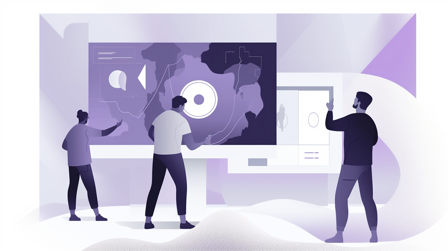
Prototypes, low or high fidelity
So if a prototype can be both low or high fidelity then where exactly does it fit in the design process then? The quick answer is anywhere during the process when you want to obtain proof of concept. Typically though a prototype is usually at the final stages of design and acts as a bridge to the actual product. A popular process is to quickly start with a low-fi prototype as practiced by Apple with the design of many early prototypes, and then progressively iterating into more and more hi-fi versions. This is really the foundation methodology for any user-centric and customer-driven design as also recommended by notable entrepreneur Andrew Chen. On the flip side, the methodology of using a hi-fi prototype is very common and well documented by SVPG partner Marty Cagan. Regardless of where in the process it falls or whether it is low or high fidelity, in addition to having a more polished UI, a prototype will include functionality. A final prototype may not have every interaction and animation in place but it will have the key interactions that will give a clear understanding of how the end product will function. So in other words, a good working prototype will be interactive and will resemble the final product as close as possible.
Interactive prototypes are also way better for user testing as they resemble the end design closely. So any feedback you get from user testing will be close to any feedback you would get for your final product. Obviously having that kind of user feedback for your product before you invest money into code is invaluable.
For ideas and strategies on conducting successful user testing, I highly recommend Stephen Krug’s “Rocket Surgery Made Easy: The Do-It-Yourself Guide to Finding and Fixing Usability Problems”. Basically, a good user testing does not need to be complicated but you do need to know your target audience well and understand their expectations and needs and test your prototype with those needs and expectations in mind. In other words set tasks and goals against those needs and expectations.
Prototyping tools
The good news is that in 2022 there are lots of great tools that you can create High Fidelity interactive prototypes with without any coding knowledge or a steep learning curve. Here’s a list of a few that I’ve worked with that I think are pretty great.
Axure
This is the tool that I started out with and was my primary prototyping tool until last year. What I like about Axure is the variety of pattern libraries available both on Axure’s website and various other sites. Pattern libraries are a great way to quickly prototype an idea without needing to build complex behaviours from scratch. Axure works mostly as an application on your computer, so you can work with it offline if you need to. They have a fantastic support team and a very active forum.
Invision
I love Invision and was probably one of the very early adopters of this platform but I don’t really consider Invision to be a fully fledged prototyping tool. At the moment it is not possible to create complex interaction designs with Invision. Invsion is great for quickly testing a design in a browser or smartphone, but you still need an application like Photoshop or Sketch to create mockups and then import them into Invision. I consider Invision to be mostly a presentation and collaboration tool. I use Invision to present my mock-ups to client or colleagues and to create some basic interactions with those mock ups. Invision is cloud based so you need an internet connection to work with it or to make presentations with. It’s really easy to use and by far much better than sharing JPEGS or PDFs with clients.
UXPIN
Right now this is my absolute favourite UX tool. It’s cloud based so you’re creating in the browser from the get go. You don’t really need to import or export anything to create your prototype even though they do have a pretty robust plugin for importing Photoshop CC layered files and also Sketch files. Most of the modern pattern libraries are available right from within the app so that you can easily assemble various complex behavioural patterns and customize those patterns as you like. Adding animation and interactivity is also relatively easy to do. If you like to start your designs with mock-ups, then their Photoshop and Sketch plugin does a really good job of importing your designs for a high-fidelity finish.
Webflow
I just started using this tool very recently and thus far I am quite impressed by it. This is a unique tool and could actually alter my workflow as it could potentially eliminate the need to create mockups altogether. Webflow is really an all-in-one web design platform that pumps out pretty decent and clean CSS and Javascript. The app is designed to produce clean HTML syntax with simple drag-and-drop. This really could be the future of front-end especially for designers who do not code and seems to be a viable option in turning complex designs into usable code and hi-fi prototypes.
Let me know what process works for you or what tools you prefer to use?